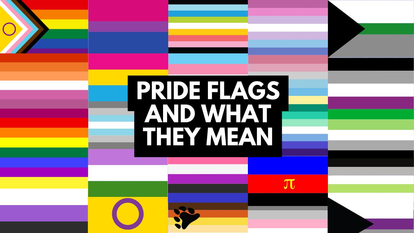
A Guide to LGBTQ+ Flags: Celebrating Diversity and Pride
The rainbow flag has long been a symbol of LGBTQ+ pride and visibility, but did you know that there are many other pride flags representing the vast spectrum of identities within the LGBTQ+ community? From the well-known rainbow to lesser-known flags for identities such as non-binary, asexual, genderqueer, and more, each flag has its own unique story and meaning. These flags celebrate the diversity, individuality, and strength of the LGBTQ+ community, offering a way for people to proudly express who they are. In this article, we’ll explore the rich history behind these vibrant symbols and the many identities they represent.

The Pride Shop aims to create a space where all our identities are valid and acknowledged, so we offer the greatest selection of products aimed at as many identities as possible.
Everyone in the LGBTQ+ community has a connection to pride flags. For some, it brings a sense of belonging; for others, it serves as a way to come out or show support for the LGBTQ+ community. Each flag carries deep meaning and purpose for those who wave it. It all began in 1977…
Table of Contents of Pride Flags
RAINBOW PRIDE FLAGS & UMBRELLA
Gilbert Baker (The Original Pride Flag)

The Gilbert Pride Flag: The Flag That Started It All
In 1977, Gilbert Baker—an artist, activist, and openly gay military veteran—designed the flag that would become a global symbol of LGBTQ+ pride. At the request of Harvey Milk, a pioneering figure in the LGBTQ+ rights movement, Baker crafted a vibrant flag with eight distinct colours, each carrying its own significance.
Inspired by the iconic song “Over the Rainbow” from The Wizard of Oz, Baker chose the rainbow to represent the diversity and unity of the LGBTQ+ community. Each colour had a special meaning:
- Hot Pink: Sex
- Red: Life
- Orange: Healing
- Yellow: Sunlight
- Green: Nature
- Turquoise: Magic & Art
- Indigo: Serenity
- Violet: Spirit of the LGBTQ+ community
This original flag marked the beginning of a powerful symbol for pride and inclusivity that continues to inspire today.
Standard Rainbow Pride Flags

The 6-Color Pride Flag is one of the most iconic and widely recognized LGBTQ+ flags in history. Featuring red, orange, yellow, green, indigo, and violet stripes, it has become the standard symbol of the LGBTQ+ community. Originally, the flag included a hot pink stripe, but due to the difficulty of sourcing pink fabric, it was excluded from production as demand soared after the tragic assassination of San Francisco City Supervisor Harvey Milk on November 27, 1978.
In 1979, the flag underwent another change. To line the parade route with rainbow banners on each streetlamp, Gilbert Baker, the flag’s creator, aimed for symmetry by splitting the design into an even number of stripes. To achieve this, he removed the turquoise stripe from the seven-stripe flag, creating the six-stripe version that would go on to be the universally recognised Pride flag used today.
Philly Rainbow (More Pride)

The Philadelphia Pride Flag was introduced in 2017 as part of the “More Color More Pride” campaign in response to growing calls for more inclusivity within the LGBTQ+ community. Designed by a small Philadelphia-based PR agency, the flag features the traditional rainbow stripes with the addition of black and brown stripes. These new stripes represent people of colour, acknowledging the historical exclusion they faced within the broader gay rights movement.
The flag gained significant visibility when American actress and advocate Lena Waithe wore it as a cape at the 2018 Met Gala. Waithe, a powerful voice for Black representation in entertainment, helped bring widespread attention to the Philadelphia Pride Flag, furthering its message of inclusivity and solidarity.
Progress Pride

As society and the LGBTQ+ community continue to evolve, the Progress Pride Flag has emerged as a powerful emblem of inclusion and forward movement. Redesigned with a focus on diversity and progression, the flag celebrates the wide spectrum of identities under the LGBTQ+ umbrella. What makes the community so special, unique, and powerful is its inclusivity of people from all walks of life.
The modern Progress Pride Flag incorporates additional stripes to represent people of colour, as well as those who identify as transgender, gender nonconforming (GNC), or undefined.
Daniel Quasar’s design blends the colours of the transgender flag with black and brown stripes, echoing the message of the 2017 Philadelphia Pride Flag, which aimed to uplift queer and trans people of colour. These stripes also honour those living with HIV/AIDS, those who have passed from the virus, and the lingering stigma around HIV/AIDS.
Intersex Inclusive

In 2021, the Progress Pride Flag underwent another revision by Valentino Vecchietti of Intersex Equality Rights UK to include representation for intersex people. The updated design features a yellow triangle with a purple circle in the centre, reflecting the intersex flag, now integrated into the chevron of the Progress Flag.
This evolution of the community’s pride flags underscores the importance of ongoing inclusion and solidarity within the LGBTQ+ community.
Queer

The term “queer” is often used as an umbrella term to encompass a wide range of non-normative sexual orientations and gender identities. The Queer Flag, sometimes referred to as the “Queer Pride Flag,” is designed to represent the broad and inclusive nature of the queer community. Here’s a general overview of the Queer Flag and its elements:
The multi-colored Queer Flag features
- Pink and blue stripes side by side to symbolize same-gender attraction.
- Orange and green stripes represent non-binary genders.
- Black and white stripes reflect the asexual, aromantic, and agender spectrums.
The Queer Flag may have different variations and designs, but it generally aims to celebrate the diversity and inclusivity of the queer community. It serves as a symbol of pride, unity, and acceptance for individuals who identify as queer and for those who embrace non-normative expressions of sexuality and gender. Check out our queer products and gifts
Straight Ally

The Straight Ally Flag is designed to represent individuals who support LGBTQ+ rights and advocate for equality, despite not being part of the LGBTQ+ community themselves. The flag’s design typically features the following elements:
- Rainbow Stripe: A horizontal rainbow stripe across the flag symbolizes the LGBTQ+ community and its diversity. This stripe shows solidarity and support for LGBTQ+ rights.
- White Stripe: The flag often includes a white stripe to represent the straight ally’s commitment to inclusivity and support for the LGBTQ+ community. The white stripe signifies neutrality and the ally’s role in advocating for equal rights.
- Black Stripe: Some versions of the flag include a black stripe to emphasize the ally’s dedication to addressing issues such as discrimination and violence against the LGBTQ+ community.
The Straight Ally Flag is just one of the pride flags to show a visual symbol of support from those who are not part of the LGBTQ+ community but are committed to advocating for equality and justice.
Sexuality Flags
Abrosexual

The Abrosexual Pride Flag has existed since 2015. The flag was created by Mod Chad of pride-flags-for-us after another anonymous person requested it. It is unknown why this person chose these colours specifically.
Abrosexual refers to an individual whose sexuality is changing or fluid. For example, someone could be gay one day, then be asexual the next, then polysexual the next. While it is possible – and even common – for a person’s sexual identity to shift or change in some way throughout their life, an abrosexual person’s sexuality may change more frequently, over the course of hours, days, months, or years. Because of their inconsistent attraction, some abrosexual people may not feel compelled to seek out a relationship or may prefer a wavership.
The timing of the fluctuations is different for every person; for some the fluctuations may be erratic and for others they may be regular. The sexualities that a person fluctuates between also varies. Some abrosexual people may be fluid between all sexualities, while others may only be fluid between a few. Check out some of our abrosexual gifts.
Aceflux

Aceflux is a term used within the asexual and aromantic communities to describe someone whose experience of their asexuality and/or aromanticism fluctuates over time.
Specifically, aceflux refers to individuals who may experience periods of feeling completely asexual or aromantic, followed by periods of feeling varying degrees of sexual or romantic attraction. These fluctuations can be gradual or sudden, and may occur over any length of time, from days to months to years.
One common design for an aceflux flag features the colours black, grey, white, purple, and pink. The black and grey stripes represent asexuality and grey-asexuality, respectively, while the white stripe represents the fluidity or variability of one’s orientation. The purple and pink stripes represent romantic attraction and the presence of other identities or orientations, respectively. You can view more flags here.
Androphilia

The Androphilia Flag is designed to represent individuals who are attracted to masculinity, regardless of the gender identity of the person exhibiting masculine traits.
The flag often features these colors in horizontal or vertical stripes, or in a design that highlights the interplay between masculinity and attraction. It is intended to celebrate and affirm the experiences of those who are drawn to masculine qualities across a spectrum of gender identities.
Asexual

The Asexual Pride Flag was created in 2010 by the Asexual Visibility and Education Network (AVEN) to represent the diverse experiences of the asexual community. Asexuality is generally defined as the lack of sexual attraction to others or a low interest in sexual activity, though its meaning can vary from person to person. It’s important to ask individuals what asexuality means to them, as some may prioritise other forms of attraction in place of or alongside sexual attraction.
Asexuality can also be an umbrella term, and each colour on the flag reflects a different aspect of the community:
- Black symbolizes asexuality itself.
- Gray represents demisexuality, where sexual attraction only develops after a deep emotional connection.
- White stands for allies who support the asexual community.
- Purple represents the broader asexual community and its unity.
This flag honours the spectrum of identities within the asexual community while fostering visibility and understanding.
AroAce

The AroAce Flag: Representing Aromantic Asexuality
The AroAce Flag symbolizes individuals who identify as both aromantic (experiencing little to no romantic attraction) and asexual (experiencing little to no sexual attraction). The flag highlights the intersection of these two orientations and celebrates those who fall under both umbrellas. Its colors and stripes are designed to represent the diversity within this community:
- Orange: Represents community and the strength of the AroAce identity, symbolizing the unification of people who are both aromantic and asexual.
- Yellow: Symbolizes friendship and other types of non-romantic and non-sexual relationships that are important to AroAce individuals.
- Light Green: Reflects aromanticism and the unique experiences of those who identify as aromantic.
- White: Stands for the shared identities and experiences of those within the aromantic and asexual spectrums.
- Blue: Represents asexuality and the absence of sexual attraction.
- Dark Blue: Symbolizes the diversity within the AroAce community, including the wide range of identities and experiences.
The AroAce Flag provides visibility and recognition to those who navigate both aromantic and asexual identities, acknowledging their experiences and relationships.
Aromantic

The Aromantic Flag was created to represent individuals who experience little to no romantic attraction to others. It is a symbol of the aromantic community and aims to provide visibility and recognition for those who identify as aromantic. The flag consists of five horizontal stripes with the following colors:
- Green: Represents the aromantic community and the spectrum of aromantic identities. Green is often associated with the idea of being free from romantic attraction, symbolizing the aromantic experience.
- Light Green: Symbolizes the diverse spectrum of aromantic experiences and the different ways aromantic individuals navigate relationships.
- White: Represents the romantic spectrum, acknowledging that aromantic individuals still exist within a world where romantic attraction is common, and recognizing the neutrality of the aromantic experience in relation to romantic norms.
- Gray: Reflects the gray area between aromantic and other romantic orientations, encompassing those who might experience romantic attraction only in limited or specific circumstances.
- Black: Represents the absence or lack of romantic attraction, emphasizing the central aspect of the aromantic identity.
The flag’s design highlights the variety within the aromantic community and provides a visual representation of aromantic experiences and identities.
Autosexual
The blue and grey Autosexual flag is another design used to represent autosexuality. This flag incorporates a colour scheme that highlights themes of self-attraction and self-recognition. Here’s a breakdown of the flag’s colours and their meanings
- Blue: Represents self-love and introspection. Blue is often associated with calm, clarity, and depth of personal feelings, reflecting the emotional and reflective aspects of autosexuality.
- Grey Reflects neutrality and balance. Grey is used to signify the personal and internal nature of autosexual attraction, representing a subtle and nuanced connection to oneself.
Bisexual

Designed in 1998 by Michael Page, the Bisexual Pride Flag visually represents the experience of bisexuality through a blend of colours. The flag features pink, blue, and purple stripes, each symbolizing different aspects of bisexual attraction and identity.
- Pink signifies attraction to the same gender.
- Blue represents attraction to a different gender.
- Purple, created by the overlap of pink and blue, symbolizes attraction to multiple genders, capturing the essence of bisexuality.
The design reflects how bisexual individuals can navigate and blend into both the straight and gay communities, while also highlighting their unique position within the spectrum of attraction.
Bear

The Gay Bear Flag was created to represent the bear subculture within the LGBTQ+ community, which includes men who are typically larger, hairy, and often project a rugged or masculine image. This subculture embraces diversity in body types, ages, and appearances, and the flag serves as a symbol of pride and belonging for these individuals. The flag was designed by Craig Byrnes in 1995 and features seven horizontal stripes with the following colours:
- Dark Brown: Represents bears with dark brown fur or hair.
- Orange: Symbolizes bears with orange or reddish hair, often referring to redheads.
- Golden Yellow: Represents bears with blond or light-coloured hair.
- Tan: Acknowledges bears with light skin tones or fur.
- White: Symbolizes bears with white fur, often representing older or mature men with gray or white hair.
- Gray: Represents bears with grey fur or hair.
- Black: Symbolizes bears with black fur or hair.
At the top left corner of the flag, there’s a black bear paw print, symbolizing strength, power, and connection to the “bear” identity. The flag’s colours are meant to represent the diversity of skin tones and hair colours found within the bear community. It serves as a symbol of pride and inclusion for men who identify with this subculture, celebrating body positivity, masculinity, and diversity.
Demiromantic

The Demiromantic Pride Flag is designed to represent individuals who experience romantic attraction only after forming a deep emotional connection with someone. The flag was created to provide a visual symbol for this specific romantic orientation. It typically features the following elements:
- Black: The sexuality spectrum as a whole
- Gray: Grayaromanticism and demiromanticism
- White: Platonic and aesthetic attraction, queer/quasi-platonic relationships, or being outside the straight-gay and male-female binaries
- Green: Demiromanticism, or the aromantic spectrum
The flag’s design emphasizes the journey from emotional connection to romantic attraction, celebrating the unique experience of demiromantic individuals.
Gay Men

The Gay Men’s Pride Flag, while less commonly known, represents a significant aspect of LGBTQ+ pride. Featuring shades of green, blue, and purple, this flag is a contemporary update to an earlier version that predominantly used various tones of blue.
The original flag, with its blue hues, was criticized for reflecting stereotypes associated with the gender binary. In response, the updated flag was designed to be more inclusive, embracing a broader spectrum of identities within the gay male community. This includes transgender, intersex, and gender nonconforming men, ensuring that the flag represents a diverse range of experiences and identities.
The modern Gay Men’s Pride Flag highlights the evolving nature of pride symbols and reflects a commitment to inclusivity within the gay community.
Grey Asexual

The Graysexual Pride Flag was first created by Milith Rusignuolo in 2013. The design features a distinctive pattern with two purple stripes at the top and bottom, two gray stripes in the middle, and a white stripe at the centre. This color scheme reflects the experience of graysexual individuals, who have a unique relationship with sexual attraction.
- Purple represents asexuality, signifying the starting point of having no sexual attraction.
- Gray indicates periods of partial or infrequent sexual attraction, bridging the gap between asexuality and allosexuality.
- White symbolizes allosexuality, the experience of sexual attraction, drawn from the asexual flag to represent moments of attraction.
Graysexuality describes individuals who identify as asexual but experience sexual attraction in a way that doesn’t fit neatly into primary asexual categories. This flag encapsulates the nuanced spectrum of attraction that graysexual people may experience, highlighting their distinct position within the broader asexual community.
Gynephilia

The Gynephilia Flag is designed to represent individuals who are attracted to femininity, regardless of the gender of the person exhibiting that trait. It highlights an attraction that is focused on feminine qualities rather than the gender identity of the individual. Here’s what the flag typically includes:
- Pink Stripe: Represents attraction to femininity and female-presenting individuals.
- White Stripe: Symbolizes the neutrality of the attraction in terms of gender, acknowledging that the focus is on feminine traits rather than the gender identity.
- Blue Stripe: Reflects the presence of masculine traits in some individuals and acknowledges the fluid nature of attraction.
The flag often features these colors in horizontal stripes or a design that emphasizes the interplay between femininity and attraction. It is intended to celebrate and affirm the experiences of those who find themselves attracted to feminine characteristics across a spectrum of gender identities.
Lesbian Flag

The Lesbian Pride Flag, created by Natalie McCray in 2010, is a significant symbol within the LGBTQ+ community, though it may be less well-known. Featuring various shades of pink and sometimes adorned with a red kiss to represent lipstick lesbians, this flag is a notable emblem of lesbian identity.
However, some within the lesbian community critique this flag for not fully representing butch lesbians. Despite this, the flag remains one of the most recognized symbols for lesbian pride.
The colours on the flag are imbued with meaning:
- Darkest Orange: Gender nonconformity
- Middle Orange: Independence
- Lightest Orange: Community
- White: Unique relationships to womanhood
- Lightest Pink: Serenity and peace
- Middle Pink: Love and sex
- Darkest Pink: Femininity
Each hue reflects different facets of lesbian identity, celebrating a range of experiences and expressions within the community.
Labrys Flag

The Labrys Flag is a prominent symbol within the lesbian and feminist communities. It features a distinctive design with the following elements:
- Labrys: The flag prominently features a double-headed axe, known as a labrys, which is a symbol of matriarchy, strength, and empowerment. Historically, the labrys was used as a weapon and a ceremonial tool, and it has been reclaimed as a symbol of feminist resistance and lesbian pride.
- Colors: The flag typically includes a background in shades of purple or pink, colors traditionally associated with lesbian pride. Some versions also incorporate black or white to emphasize contrast and visibility.
Symbolism:
- Labrys: Represents strength, independence, and the power of women and lesbians. It is often associated with lesbian feminism and the rejection of traditional gender roles.
- Colors: Purple is commonly used to represent the lesbian community, blending the colors of pink and blue to symbolize the intersection of femininity and masculinity. Pink can signify lesbian pride, while black and white may be used for contrast or additional symbolism.
The Labrys Flag serves as a powerful emblem of lesbian pride, feminist solidarity, and the broader fight for gender equality and empowerment.
Lithromantic

Lithromantic, also known as akoiromantic or apromantic, refers to a romantic orientation where an individual experiences romantic attraction but does not desire it to be reciprocated. In some cases, the attraction may fade once it is returned, or the person may not have the need to act on their romantic feelings.
Key aspects of lithromanticism:
- Romantic Attraction: Lithromantic individuals can feel romantic attraction towards others, but they do not seek or need a mutual romantic relationship.
- No Desire for Reciprocation: Lithromantic people are often content with unreciprocated feelings and may not want their romantic interest to lead to a relationship.
- Fading Interest: For some, if romantic feelings are returned, their attraction may lessen or disappear.
Lithromanticism falls under the aromantic spectrum, representing a unique way of experiencing and processing romantic feelings. It’s important to note that, like all romantic identities, lithromantic people may have varying experiences and preferences regarding relationships.
Omnisexual

The Omnisexual Pride Flag was created to represent individuals who are attracted to all genders, but with an emphasis on the attraction to each gender in a distinct way. The flag typically features the following colors and layout:
- Pink: Represents attraction to those who identify as female or feminine.
- Blue: Symbolizes attraction to those who identify as male or masculine.
- Purple: Reflects attraction to those who identify as non-binary or other genders outside the traditional binary.
The design often includes a pattern that combines these colors in a way that emphasizes inclusivity and the spectrum of attractions that omnisexual individuals experience. This flag highlights the belief that attraction can encompass a wide range of gender identities and expressions, celebrating the diversity of the omnisexual experience.
Pansexual

Created in 2010, the Pansexual Pride Flag represents the unique experiences of individuals who are attracted to others regardless of gender. Pansexuality encompasses attraction to people of any gender, whether they identify as male, female, both, or neither. This orientation asserts that gender and sex are not factors in their romantic or sexual attraction.
The flag features three distinct colors:
- Pink symbolizes attraction to women.
- Blue represents attraction to men.
- Yellow stands for attraction to those who don’t identify strictly with either gender.
Pansexuality can be seen as a distinct sexual orientation or a broadening of bisexuality, emphasizing a rejection of the gender binary. By being open to relationships with individuals of any gender identity, pansexuality is often viewed as a more inclusive term within the spectrum of sexual identities.
Polysexual
The Polysexual Pride Flag was created in 2012 by the Tumblr user “Polysexuality” to represent individuals who are attracted to multiple genders but not necessarily all genders. The flag features three horizontal stripes in different colours:
- Pink: Represents attraction to those who identify as female or feminine.
- Blue: Symbolizes attraction to those who identify as male or masculine.
- Green: Represents attraction to individuals who do not fit within the traditional binary genders, encompassing a spectrum of other genders.
The flag’s design highlights the diversity within polysexuality, acknowledging that attraction can extend beyond just male and female genders to include a variety of non-binary and other gender identities. The colours chosen emphasize the inclusive nature of polysexuality, celebrating the broad range of attractions that individuals with this orientation may experience.
Polyamory
The Polyamory Flag was created by Jim Evans in 1995 to represent the polyamorous community, which embraces consensual and ethical non-monogamous relationships. The flag consists of three horizontal stripes in different colors:
- Red: Represents the love and passion that polyamorous people feel for their partners.
- Black: Symbolizes the strength of the relationships and the importance of respecting boundaries and honesty within polyamorous connections.
- Blue: Reflects the openness and trust required in polyamorous relationships, emphasizing the positive aspects of transparency and communication.
In the centre of the flag, there is a white “infinity heart” symbol. This symbol combines the infinity sign and a heart, representing the limitless nature of love and the deep, enduring connections possible in polyamorous relationships.
The flag is designed to celebrate the diversity and complexity of polyamorous relationships while promoting a sense of community and understanding among those who practice consensual non-monogamy.
Skoliosexual
Uranic
Gender Identity Flags
Agender
Bigender
The Bigender Pride Flag has seen several versions since its inception, with the original design by the Tumblr user no-bucks-for-this-does. Although the exact creation date is uncertain, it is believed to have existed before July 30, 2014. This original flag features shades of pink, blue, and purple, with a central white stripe. While the precise meaning of the colors is not officially documented, it is commonly interpreted as follows:
- Blue represents masculinity.
- Pink signifies femininity.
- Purple symbolizes a blend of genders or androgyny.
- White in the centre highlights the nonbinary aspect of bigender identities.
In addition to the original flag, there is a widely used variation that includes four horizontal stripes in pink, yellow, white, purple, and blue. Created either before or on August 23, 2015, by an unknown designer, this version adds yellow to the palette. Though the specific meanings of the colours in this variant are not officially defined, it is generally assumed that:
- Yellow represents non-binary identities, complementing the colours of the original flag.
A bigender individual experiences or identifies with two distinct genders, which can be any combination of binary or non-binary genders. For instance, a person might identify as both a woman and a man, or as agender and a woman at the same time. These genders may be experienced simultaneously or alternately, and the intensity or nature of these experiences can vary widely among bigender individuals.
Demiboy

Created in 2015 by the Tumblr user Transrants, the Demiboy Pride Flag features four distinct colors, each symbolizing different aspects of the demiboy identity. Although Transrants did not provide explicit explanations for the colors, the demiboy community has since assigned their meanings:
- Blue: Represents manhood and masculinity.
- White: Signifies non-binary or agender identities.
- Shades of Grey: Reflect the gray areas and partial connections to other genders, acknowledging experiences that are not strictly binary.
A demiboy, also known as demiguy, demiman, demimale, or demidude, identifies with the concept of masculinity to varying degrees but does not exclusively align with the male gender. This flag embodies the nuanced and partial connections to masculinity that characterize the demiboy experience.
Demigirl

The Demigirl Pride Flag was created in 2015 by the Tumblr user Transrants, the same creator of the Demiboy Pride Flag. This flag is designed to represent individuals who identify partially or somewhat with femininity but do not fully align with the female gender.
Flag Design and Color Meanings:
- Pink: Represents womanhood and femininity.
- White: Symbolizes non-binary or agender identities.
- Shades of Grey: Reflect the gray areas and partial connections to other genders beyond the binary concept of male and female.
A demigirl, also known as demigoddess, demiwoman, or demifemale, experiences a connection to femininity that is not absolute. This identity often encompasses individuals who feel partially aligned with the female gender but may also identify with other genders or experience their femininity in a nuanced way. The flag celebrates these diverse and fluid experiences within the spectrum of gender identities.
Genderfluid

Genderfluid individuals experience a fluid or shifting gender identity that may change over time, whether by day, week, or other periods.
The Genderfluid Pride Flag, created by JJ Poole in 2012, uses a combination of five colors to represent different aspects of gender fluidity. Each color has a specific meaning:
- Pink: Represents femininity and the experience of identifying as or expressing feminine traits.
- Blue: Symbolizes masculinity and the experience of identifying as or expressing masculine traits.
- Purple: Reflects a blend of both masculine and feminine traits, representing the fluidity between different genders.
- Black: Stands for the full spectrum of gender identities and experiences that fall outside the binary, including non-binary and agender identities.
- White: Signifies the flexibility and fluid nature of gender, acknowledging that gender can be fluid and may change over time.
Together, these colors capture the dynamic and ever-changing nature of gender fluidity, celebrating the varied and personal experiences of those who identify as genderfluid.
Genderflux

The Genderflux Pride Flag, with its most commonly used version, features six horizontal stripes in different colours. While the exact creator and date of the flag remain unknown, it is speculated to have been created between 2014 and 2015. The flag is designed to represent the diverse experiences of genderflux individuals, whose sense of gender or its intensity may shift over time.
The colours on the flag are:
- Dark Pink: Represents women.
- Light Pink: Symbolizes demi girls (those who experience a partial connection to the female gender).
- Gray: Stands for agender identities, indicating a lack of gender.
- Light Blue: Represents demi boys (those who experience a partial connection to the male gender).
- Dark Blue: Signifies men.
- Yellow: Denotes non-binary genders.
Genderflux is a term used to describe a range of gender identities where an individual’s gender or the intensity of their gender experience fluctuates over time. This flag provides visibility to those whose gender identity may vary in depth or expression, reflecting the fluid nature of their experience.
Genderqueer

Created in 2011 by Marilyn Roxie, a genderqueer advocate and writer, the Genderqueer Pride Flag features three horizontal stripes in lavender, white, and dark chartreuse green. Each color represents different aspects of genderqueer identities:
- Lavender: A blend of pink and blue, traditionally associated with femininity and masculinity, signifies queer identities and androgyny.
- White: Represents gender-neutral and agender identities, highlighting the spectrum of gender experiences outside traditional categories.
- Chartreuse Green: Symbolizes identities that fall outside the gender binary and the concept of a third gender.
Genderqueer individuals do not conform to conventional gender distinctions. They may identify with neither, both, or a combination of male and female genders. While similar to non-binary, genderqueer often serves as an umbrella term encompassing any identity that diverges from the cisgender norm. This flag celebrates the diversity and fluidity of gender identities that challenge traditional gender categories.
Intersex

Before the current Intersex Flag was created, several versions were introduced, incorporating elements such as the rainbow—a common symbol of queer pride—and colors like blue and pink, reflecting those of the transgender flag. However, in 2013, Morgan Carpenter designed the Intersex Flag with a unique identity, choosing to move away from traditional LGBTQ+ symbols.
Carpenter selected yellow and purple for the flag, as neither color is tied to the gender binary, symbolizing the freedom of intersex people to exist outside of societal constructs. The flag features a simple, unbroken circle at its center, representing wholeness, completeness, and the integrity of intersex individuals. This design serves as a powerful reminder that intersex people are perfect just as they are—or as they choose to be.
Maverique
First created on Tumblr in 2014 by Vesper H. (queerascat), the Maverique Pride Flag introduces the term “Maverique” to describe a distinct non-binary or abinary gender identity. The term combines “maverick,” suggesting independence and non-conformity, with the French suffix “-ique,” highlighting its unique nature. Maverique is characterized by significant gendered experiences that do not fit within the traditional male or female categories. It is not a lack of gender but rather an expression of autonomy and a strong inner conviction about a gender identity that lies outside conventional norms.
The colors of the Maverique Pride Flag are yellow, white, and orange, each representing different aspects of the maverique identity:
- Yellow symbolizes non-binary gender. As a primary color that stands independently from other primary colors (cyan and magenta), yellow reflects maverique’s distinct relationship with masculinity and femininity. Yellow is often associated with non-binary identities.
- White signifies autonomy and independence from the gender binary. It represents the blank slate upon which the maverique identity is built, separate from traditional gender combinations of blue (masculinity) and pink (femininity).
- Orange represents the inner conviction of a maverique’s understanding of their gender. It also conveys the unorthodox and individualistic nature of being a maverique.
The Maverique Pride Flag celebrates a unique and personal approach to gender, embracing the diversity and autonomy of those who identify as Maverique.
Neutrois

Neutrois is a non-binary gender identity characterized by a feeling of neutrality or the absence of gender. People who identify as neutrois often feel that they are gender-neutral or agender, meaning they do not experience themselves as male, female, or any other specific gender.
Key features of the neutrois identity:
- Gender Neutrality: Neutrois individuals often feel a strong connection to neutrality in terms of gender, rejecting traditional gender roles or categories.
- Minimal or No Gender: Some neutrois individuals describe themselves as having no gender at all, similar to being agender.
- Desire for Genderlessness: Many people who identify as neutrois may seek to minimize or neutralize gender markers (e.g., through clothing, pronouns, or medical interventions).
While every neutrois person’s experience is different, the common thread is a feeling of gender that doesn’t align with binary concepts of male or female. Some may use gender-neutral pronouns like “they/them,” while others might use different pronouns, depending on personal preference. Neutrois is one of many identities within the broader non-binary and genderqueer umbrella, emphasizing the diversity of experiences outside traditional gender norms.
Non Binary

In 2014, Kye Rowan designed the Nonbinary Pride Flag to give visibility to individuals whose gender identity does not conform to the traditional male/female binary. Featuring four distinct colours—yellow, white, purple, and black—each stripe represents a different aspect of nonbinary identity.
- Yellow symbolizes those who exist outside the binary of male and female, standing for people who identify beyond traditional gender definitions.
- White represents multi-gendered individuals, as the colour white contains all colours, signifying the blending of multiple gender identities.
- Purple echoes the lavender in the genderqueer flag, symbolizing those who identify as a mix of male and female genders.
- Black, the absence of colour, stands for agender people who feel they do not have a gender at all.
Additionally, many nonbinary individuals prefer gender-neutral pronouns, with the most common being singular ‘they,’ ‘them,’ and ‘their.’ The Nonbinary Pride Flag is a powerful reminder of the diverse experiences and identities within the LGBTQ+ community.
Transgender
The Transgender Pride Flag was created by Monica Helms, a transgender woman, in 1999. It was designed to provide a symbol that reflects the experiences and pride of transgender individuals. The flag consists of five horizontal stripes:
- Light Blue: Represents the traditional colour for boys and masculinity. It symbolizes the gender assigned at birth and the desire to align with one’s gender identity.
- Light Pink: Represents the traditional color for girls and femininity. It signifies the gender assigned at birth and the journey towards aligning with one’s true gender identity.
- White: In the centre of the flag, the white stripe represents those who are transitioning, as well as those who identify as non-binary, genderqueer, or agender. It symbolizes the space between genders and the idea of a new beginning or identity.
- Light Pink: Reflects the transition from assigned female at birth to one’s true gender identity.
- Light Blue: Completes the cycle, mirroring the traditional association with masculinity and the alignment with one’s true self.
The design of the flag is intended to be symmetrical, which is a metaphor for the idea of finding congruence and balance in one’s gender identity. The flag’s colors and layout represent both the journey of transition and the pride in one’s true gender identity.
Transfeminine
The Transfeminine Pride Flag was created in 2017 by the user “TransFemme” on DeviantArt. It is designed to represent individuals who are assigned male at birth but identify with a feminine gender or expression. The flag consists of five horizontal stripes:
- Light Pink: Represents femininity and the gender experience of transfeminine individuals.
- White: Symbolizes the transition phase and the space between genders, reflecting both the journey and the non-binary aspects of transfeminine identities.
- Light Blue: Traditionally associated with masculinity, it acknowledges the individual’s past or their experience of being assigned male at birth.
- Light Pink: Again highlights femininity, reinforcing the core aspect of the transfeminine experience.
- Light Blue: Completes the flag’s symmetrical design, mirroring the traditional gender association while celebrating the transfeminine identity.
The flag’s design emphasizes the journey of transitioning and the blending of past and present gender experiences. The colour scheme acknowledges both the historical and current aspects of transfeminine identities, celebrating the full spectrum of their gender experience.
Transmasculine
The Transmasculine Flag is a symbol used to represent individuals who are assigned female at birth but identify or align with masculinity. This includes transgender men as well as non-binary individuals who feel a connection to masculinity but may not fully identify as male.
There is no universally recognized transmasculine flag, but a popular version includes colors that symbolize masculinity and the diverse experiences of those in the transmasculine spectrum.
- Light Pink: Represents femininity and the gender experience of transfeminine individuals.
- White: Symbolizes the transition phase and the space between genders, reflecting both the journey and the non-binary aspects of transfeminine identities.
- Light Blue: Traditionally associated with masculinity, it acknowledges the individual’s past or their experience of being assigned male at birth.
- Light Pink: Again highlights femininity, reinforcing the core aspect of the transfeminine experience.
- Light Blue: Completes the flag’s symmetrical design, mirroring the traditional gender association while celebrating the transfeminine identity.
This flag is a way for transmasculine individuals to show pride in their identity and the diversity of the transmasculine community. It emphasizes both the uniqueness of gender experiences and the shared journey of masculine alignment.
Trigender

The Trigender Flag: Representing Trigender Identity
The Trigender flag represents individuals whose gender identity encompasses three distinct genders. Trigender people may fluctuate between these three genders, experience them simultaneously, or identify with them in varying degrees at different times. The genders can be male, female, and a non-binary identity, or any other combination of three genders.
The Trigender flag features five horizontal stripes, each with specific meanings:
- Pink: Represents femininity or womanhood.
- Blue: Represents masculinity or manhood.
- Green: Symbolizes non-binary identities, including genders outside the male/female binary.
This flag reflects the diversity and fluid nature of trigender experiences, celebrating the complexity of gender beyond the binary system.
It is a way for trigender individuals to express pride in their unique gender identity.